What is a Landing Page in Advertising?
A Landing Page is the first page a user arrives at after clicking on an ad, link, or search result. This page is typically designed to achieve specific marketing objectives, guiding users to take particular actions such as signing up, purchasing a product, downloading content, or subscribing to a mailing list. Landing Pages are usually concise and goal-oriented to increase conversion rates.
In advertising, the primary purpose of a Landing Page is to convert visitors who click on an ad into potential leads or direct customers. A Landing Page is not only the first stop for users after clicking on an ad, but also a crucial step in achieving the advertising goals. Designing and optimizing an efficient Landing Page can significantly enhance the effectiveness and ROI of an ad campaign.
Features of a Landing Page
- Clear Objective: Each Landing Page is usually designed for a specific marketing campaign or goal.
- Relevant Content: The content on the page is closely related to the link or ad that the user clicked on.
- Attractive Design: The design should capture the user's attention and prompt them to take action.
- Conversion Optimization: The page should be designed to optimize user conversion rates, such as through simplified forms and clear Call to Action (CTA) buttons.
- Easy Navigation: While the Landing Page typically focuses on a single goal, it should also be easy for users to navigate to other pages if needed.
Why Use a Landing Page?

Increase Conversion Rates
- Focused Goals: Landing Pages are designed with a single objective, minimizing distractions and enhancing conversion rates.
- Clear Call to Action (CTA): They often feature prominent and clear CTAs, guiding users on what action to take next, thereby boosting the completion rate of desired actions.
Improve User Experience
- Simple Design: Landing Pages typically have straightforward designs, avoiding excessive navigation and complex content, allowing users to quickly find the information they need, thereby enhancing user experience.
- High Relevance: The content of a Landing Page is highly relevant to the ad or link that directed the user there, ensuring that users find what they expect, and reducing bounce rates.
Precise Data Tracking and Optimization
- Conversion Tracking: They allow precise tracking of user behavior and conversion paths to identify the most effective marketing activities.
- A/B Testing: Easy A/B testing to compare different versions of the Landing Page to find the best design and content combination, improving overall performance.
Enhance Brand Trust
- Trust Elements: By showcasing user reviews, client testimonials, and certifications, Landing Pages enhance credibility and authority, increasing users' trust in the brand.
- Professional Image: Professionally designed Landing Pages convey a sense of professionalism and attention to detail, leaving a positive first impression on users.
Targeted Marketing
- Target Audience: Multiple types of Landing Pages can be created for different ad campaigns, audience segments, and marketing channels, effectively meeting diverse user needs.
- Personalized Content: Content can be tailored based on user behavior and preferences, increasing relevance and user engagement.
Boost Ad Effectiveness
- Ad Match: Ensures high relevance between the ad and the Landing Page content, preventing user confusion or disappointment, thus enhancing the return on investment (ROI) of the ads.
- Reduce Bounce Rates: Highly relevant Landing Pages reduce bounce rates, improving user retention and engagement after clicking the ad.
Flexibility and Quick Implementation
- Rapid Adjustments: Landing Pages can be quickly adjusted and optimized based on market changes and user feedback, allowing for flexible responses to marketing needs.
- No Major Website Changes Needed: Creating a Landing Page doesn't require extensive changes to the entire website, reducing development costs and time.
Structure of a Landing Page
An effective Landing Page should be designed to be simple and efficient, guiding users to take action and maximizing conversion rates. Here are the typical components of a Landing Page and their detailed explanations:

Headline
- Main Headline: Captures the user’s attention and clearly conveys the primary value or offer of the page.
- Subheadline (Optional): Provides additional details or incentives to complement the main headline.
Hero Image/Video
- High-quality visual elements that clearly showcase the product, service, or offer.
- Videos can vividly explain product features or usage.
Value Proposition
- Concisely explains the unique selling points (USP) of the product or service and the benefits users can gain.
Call to Action (CTA)
- Primary CTA Button: Prominently displayed, using action-oriented language and urgency, such as "Buy Now," "Free Trial," or "Download Now."
- Multiple CTA buttons may be placed throughout the page to ensure easy access for users.
Trust Indicators
- User Reviews and Testimonials: Displays positive feedback from real users.
- Awards and Certifications: Shows relevant certifications or awards received by the company.
- Security Badges: Like SSL certificates, to ensure user information security.
Simple Form
- If user information is required, keep the form short, collecting only necessary details.
- Includes clear form titles and field labels for easy completion.
Benefits and Features
- Lists the main features and advantages of the product or service using concise text or icons.
- Uses bullet points or infographics for quick understanding.
Social Proof
- User Stories and Case Studies: Showcases success stories or user experiences to build credibility.
- Partner and Client Logos: Displays logos of well-known partners or clients.
Urgency and Scarcity
- Uses limited-time offers, countdown timers, or limited stock information to motivate immediate action.
Footer Information
- Includes company contact information, privacy policy, and terms of service.
- May include additional CTA buttons for easy access at the bottom of the page.
Example Structure for an E-book Download Landing Page
- Headline
- Main Headline: "Download Your Free Guide on Increasing Conversion Rates"
- Subheadline: "Get this expert guide now to boost your marketing results!"
- Hero Image/Video
- Cover image of the e-book or a brief introductory video.
- Value Proposition
- "Gain expert marketing tips and strategies to easily increase your conversion rates."
- CTA Button
- "Download Now" button, prominently colored and positioned.
- Trust Indicators
- User Reviews: ★★★★★
- "Recommended by over 1000 marketing experts."
- Simple Form
- Form Title: "Fill in your details to download"
- Form Fields: Name, Email
- Benefits and Features
- Provides specific marketing strategies and practical tools.
- Case studies to help you apply the techniques quickly.
- Social Proof
- User success stories.
- Recommendations from well-known brands.
- Urgency and Scarcity
- "Limited-time free download, don’t miss out!"
- Footer Information
- Contact us: [email protected]
- Links to privacy policy and terms of service.
Types of Landing Pages
Landing Pages can be categorized based on their goals and usage, each with different designs and content to meet specific marketing needs and user behaviors. Here are some common types:

Click-Through Landing Page
- Purpose: Directs users to another page, usually a product detail or shopping cart page.
- Features: Includes a brief introduction to the product or service and a strong CTA button.
- Example: An ad promoting a new product leads users to a Landing Page with product features and a "Learn More" or "Buy Now" button, directing them to the product details page.
Lead Generation Landing Page
- Purpose: Collects user information like name, email, and phone number for follow-up marketing.
- Features: Includes a concise form and a clear value proposition, emphasizing the benefits users will receive, such as a free e-book, trial, or consultation.
- Example: A software company offers a free trial, users enter their details on the Landing Page to receive the trial link.
Sales Landing Page
- Purpose: Directly sells a product or service.
- Features: Provides detailed information about the product or service, user reviews, social proof, pricing information, and multiple CTA buttons.
- Example: An e-commerce site’s specific product promotion page with product images, descriptions, and user reviews, encouraging users to buy directly.
Thank You Page
- Purpose: Confirmation page after the user completes an action (e.g., form submission or purchase).
- Features: Thanks to the user and may offer further action suggestions, such as sharing a link, downloading resources, or continuing shopping.
- Example: After downloading an e-book, users are directed to a page thanking them and providing more related resources or next steps.
Squeeze Page
- Purpose: Specifically designed to capture the user’s email address or other contact information.
- Features: Very concise, typically with one or two form fields and a strong value proposition.
- Example: A blog offers a free guide or course, requiring users to enter their email address to subscribe.
Product Showcase Page
- Purpose: Displays multiple products or services, usually for a product catalog or specific product series promotion.
- Features: Contains brief introductions to multiple products with individual CTA buttons for each, allowing users to view more details or make a purchase.
- Example: A fashion brand showcases its latest season’s collection, with “View Details” or “Buy Now” buttons for each product.
Event Registration Page
- Purpose: Promotes and registers users for specific events such as webinars, conferences, and workshops.
- Features: Includes detailed information about the event, time, location, and a registration form.
- Example: A marketing company promotes its upcoming webinar, allowing users to register on the page.
Pre-Launch Page
- Purpose: Collects user interest and contact information before a product or service officially launches.
- Features: Typically include a brief product introduction and a registration form, allowing users to sign up for launch notifications or early access.
- Example: A new app’s upcoming launch page, providing a brief introduction and a form for users to register for launch notifications.
Login Capture Page
- Purpose: Used to encourage users to sign up or log in to access specific content or features.
- Features: Emphasizes the specific benefits or features users will gain after logging in.
- Example: An online tool website requires users to sign up or log in to use its advanced features, with the page briefly highlighting the advantages of these features.
Landing Page vs. Homepage vs. Website
Purpose and Usage
- Landing Page: Focused on a single marketing goal and action, usually for specific ad campaigns.
- Homepage: Provides an overview and navigation for the website, serving as an entry point to other parts of the site.
- Website: Contains multiple pages, offering comprehensive information and services, representing the company’s overall online presence.
Content and Design
- Landing Page: Concise content, designed for conversion, minimizing distractions.
- Homepage: Broad content, designed for navigation and brand presentation.
- Website: Complex structure, includes diverse content and features to meet various user needs.
User Experience
- Landing Page: Guides users to complete a specific action, enhancing conversion rates.
- Homepage: Helps users understand the company and navigate to the desired information.
- Website: Provides a comprehensive user experience, supporting users from product discovery to purchase and support.
How to Gain Insights for Landing Page Design Inspiration?
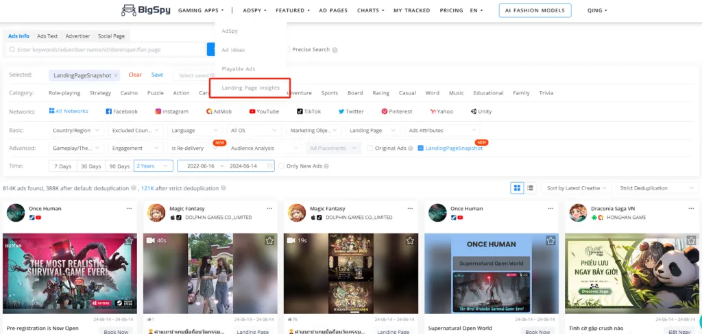
Using BigSpy, you can view high-performing ad creatives and their Landing Pages. By analyzing and learning from these data, you can understand successful Landing Page designs and activate your own design inspiration.
1. Select Landing Page Insights Feature: Choose the Landing Page insights function.
2. Choose Channels and Sorting Filters: Select the required channels and sorting filters to see all Landing Pages that meet the criteria.
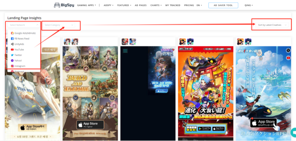
3. Analyze and Activate Design Inspiration: Use your analytical skills to deeply analyze these Landing Pages and activate your design inspiration.
