7 Winning Strategies to write a perfect Call-to-Action on Facebook Ads
Whether you are selling your products, promoting your website to sell products, or guiding you to download your application, an excellent call to action is used to improve the rapid sliding of large Ad Network information streams like Facebook, Twitter and Youtube The top priority of transformation. In the Internet media, your potential users are rapidly sliding the information stream. To attract their attention in a short time to achieve conversion, you have to master some Winning Strateies to stand out from many competitors.
- What is Call-To-Action?
- Why CTA is important?
- Basic specifications of CTA
- Winning Strategies to write a perfect Call-to-Action
What is Call-To-Action?
CTA (call-to-action) is a piece of introductory text that guides users who watch your ads to perform specific operations to accomplish your marketing purposes. “Download now”, “View details” or “free application” are common examples of call-to-action, you can find them on websites, login pages, emails, social media and even specially designed CTA buttons. They are usually a few words or a short sentence.
Why CTA is important?
When you have chosen to use beautiful pictures or videos and still attract users to stay in your advertisement, how to make users generate further actions to achieve conversion is the meaning of CTA.
In fact, CTA is just a visualized product. You do not need a CTA, but you need to give users a strong guide to take action.
So the purpose of CTA is twofold:
- Guidance: Tell users what actions they should take
- Stimulation: give them the motivation to act immediately
Otherwise, many people will quickly cross over even if they are interested in your product, and it is impossible to predict whether they can think of you again or find you again.
However, it is not possible to achieve user conversion using CTA. Many people have lost users who were interested in your ads on a bad CTA. So what kind of specifications must CTA have to be qualified?
Basic specifications of CTA
Although CTA can have thousands of different ideas, the basic content below is easily forgotten in the design process and will not achieve the effect you want.
- The language must be clear and concise: because CTA is the main purpose language for guidance, they are often short imperative sentences, and they must be accompanied by urgent or stimulating sentences. Instead of poems full of gorgeous rhetoric, that is what your advertising content should do. When you pile up product features or offers, all of your content is the focus you want to highlight, and the final result is no focus. Secondly, the CTA’s expression must be precise and clear. He does not need to be very beautiful to make it difficult to read, so the user is likely to give up reading it.
- Highlights: A good CTA is not just text, it should stand out and attract people ’s attention. The CTA button should be contrasted with the page it is on, and the text should also be highlighted.
- Reasonable location and layout: make sure that users see your CTA at the time when they are most interested in your product. If you are not sure when they are interested, you can put it at the end. This is why articles and blogs often place CTAs at the end of articles, and it is also the reason why website homepages will place CTAs at every function point to test user interest points.
- Debugging: After the initial placement of the CTA, you have to continuously pay attention to the conversion of ads, and continue to debug and test, they include text, color and position changes.
When you understand the basic CTA setting specifications, there are some winning techniques that can help you grow your business.
Winning Strategies to write a perfect Call-to-Action
- Ingeniously combined with advertising content
For example, the advertisement content of The Dog Explained is the reason for introducing pet anxiety. After attracting the curiosity of the pet user and triggering the user’s anxiety, the CTA users who use Easy-to-Read “Dog Separation Anxiety” Guide will continue to explore the pet The cause of anxiety. And use “Easy-to-Read” to inform the user that the content of the article will be very simple and easy to understand, and that the user will reduce this anxiety after reading this article.

- Make good use of social identity
For example, Korent Hemp’s advertising post attracts the audience’s interest with his own personal experience, because people are often wary of the content promoted by the advertisement, and the use of social recognition or audience evaluation will narrow the distance between the product and the user. To make users think that the effect of this product is truly visible. Although this method is very common, it has always been an effective method. A more effective method is to prove the social identity of your product with digital indicators, such as “82% user satisfaction”, and a 71.5% repurchase rate. “,” 5 years of product history, etc. “will help users reduce the alert for your products. But keep in mind that this numerical indicator cannot be overstated or it will be counterproductive.

- Discount Attraction
虽然这是一种老套的套路,但它往往是最有效的,尤其是在电商和游戏行业。这里提起这种让利促销是要提醒,这种促销方式非常常见。故普通的引导CTA可能不能打动用户,因为所有的竞争对手都可能使用这种方式。在这种引导语中,除了提供折扣、免费试用等方式更重要的是介绍自己的特色,突出产品功能与其它同类产品的差异。
如:Positive Grid 在提供打折的前提下突出了Smart Guita的特色功能。

- Highlight problems and cause anxiety
This is a must-win rule for psychology. If you directly propose a solution or introduce the function of a product, your audience may not feel the problem he is facing or feel unnecessary. But throwing out problems and influences will resonate and cause anxiety. In this anxious mood, prompt users to seek solutions you provide.
For example, STM uses the title “5 Reason Why Affiliate Business Sucks”, which causes anxiety in users in related industries and promotes click desire.

- Improve sense of humor
Do n’t forget that social media is a relaxed and entertaining environment. A call to action with a sense of humor will quickly reduce the distance to the audience and make the audience feel good about you. Don’t be afraid to make jokes, even if you are worried that your jokes are not funny, you can try it. But make sure not to lower the height of the brand and use some vulgar words with caution.
For example: Art Heroes ‘Post CTA uses popular language or uses customers’ cultural beliefs. Having said that, they are short, powerful, interesting, and make customers wonder what to say next when we communicate with them in the future.

- Make good use of retargeting Ad
There are several reasons why redirect ads are great. First, it can convert your old users or again, these users may have a certain awareness of your brand. What you need to do is to transform or transform again, which is much easier than building knowledge and then transforming.
Secondly, it can try to provide discounts, cause anxiety, etc. to improve the conversion rate. If you want to use a more effective CTA to increase your CTR, please provide financially relevant discounts to your audience-people like to save money.
- Follow competitors’ routines (introduce products)
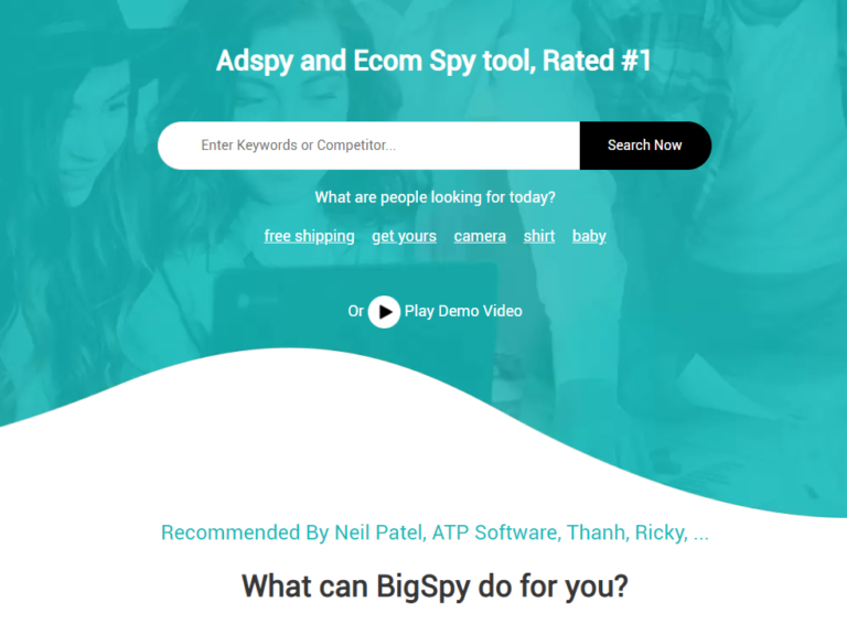
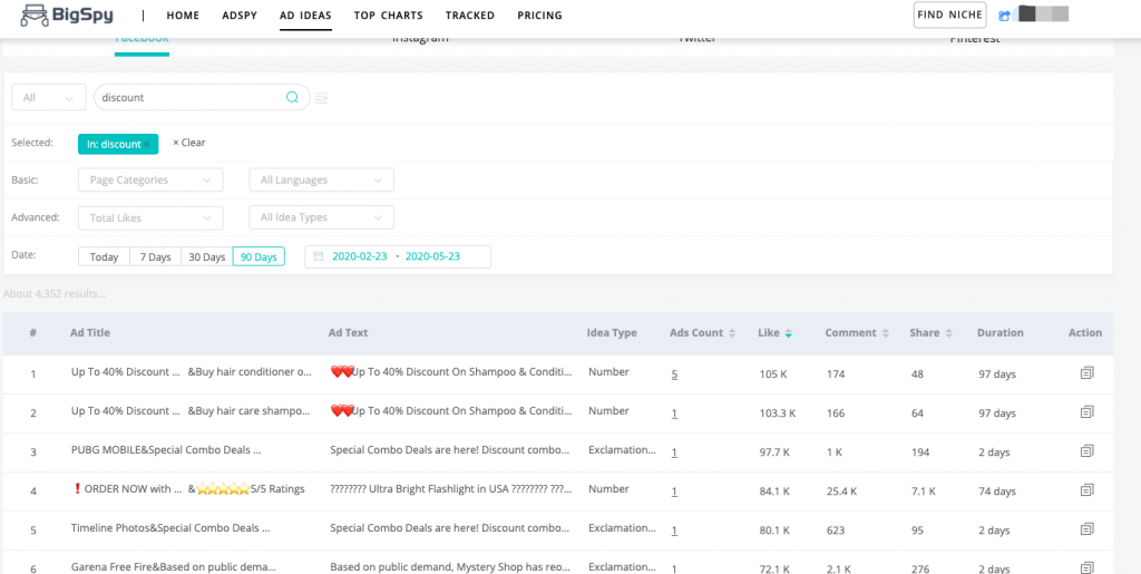
When you are not sure whether your ideas can be confirmed, it is also a shortcut to check your competitor intelligence. Here is a Ads Spy tool like BigSpy, you can search for your competitor’s advertising ideas.

BigSpy is also a competitor intelligence tools.You can also view the copy function, search for the common types of copy you want to try, and then sort by interactive feedback such as Like to see which creative copy has a good effect.
Conclusion
Having a purposeful, concise, powerful and carefully designed CTA Strategy can bring unexpected gains to your advertising. Anyway, crudely crafted or heavily used content will be overwhelmed. Many advertisers are not taking full advantage of CTA, so please review your content and see where you should try to merge it more.


