
The examples were selected from BigSpy’s trending list. Creative collection date: October 13, 2026. First-seen dates and reported running-day counts are supplied snapshot fields, not live campaign results.
Most "best video ads" round-ups hand you Coca-Cola and Nike. Those ads were built to win awards, not to be bought. You cannot ship one of them on a Tuesday.
So here are three that appeared near the top of BigSpy's trending list in the supplied snapshot. Three different categories, three different lengths, three different structures:
a mobile racing game selling car customisation — 30 seconds, square 1:1
a fintech app selling a metal card — 15 seconds, vertical 9:16, Dutch market
a cashback app teaching people how to use it — 29 seconds, vertical 9:16, German market
For each one you get the ad itself, then a segment-by-segment read of the same four things:
What's on screen — the shot, not the vibe.
What's said or written — dialogue, voiceover, on-screen text.
What you hear — music and sound design.
Which funnel stage the segment carries — attention, interest, desire, or action.
Two of the three aren't in English, so where there's copy we give you the original line and a translation. A breakdown that only works on English-language ads is a breakdown of a fraction of the market.
How we break a video ad down
Four layers. In this order.
The hook — the first 0–6 seconds. Not "is it catchy". What is the ad doing before the viewer has decided to keep watching? Asking a question, showing a result, naming something the viewer already recognises. All three of these ads put their decisive move here, and none of them opens with the product.
The body. How the product gets demonstrated. This is where most ads either earn the watch or lose it — and it's where these three diverge hardest.
The close. What the last few seconds ask for. A logo, a tagline, and an instruction are three different things, and they are not interchangeable.
The ratio between them. This is the part people skip, and it's the part you can actually copy.
Total length lies. A 30-second ad with a 3-second hook and a 27-second body behaves nothing like a 30-second ad with an 8-second hook and a 10-second body. The ratio is the tell — it tells you what the advertiser believed the viewer needed before they'd act.
One more dimension, laid over the top: which funnel stage each segment serves. Doing that across the whole runtime shows you whether an ad is front-loaded on attention and starved of proof, or the other way round.
Sample-size warning, stated once and meant properly: three ads is a sample of three. Read what follows as three worked examples of a method, not as benchmarks.
Example 1 — Highway Racer Pro: 30 seconds of customisation, zero dialogue
| Metric | Observation |
|---|---|
| Advertiser | Highway Racer Pro |
| Category | Mobile game (racing) |
| Length | 30.1s |
| Aspect ratio | 1:1 — square, 720×720 |
| First seen | 1 Aug 2026 |
| Reported running days | 72 |
| Duration ratio | hook 10% / body 78% / close 12% |
| Spoken dialogue | none |
Segment by segment
| Time | What's on screen | Dialogue / text | Sound | Funnel stage |
|---|---|---|---|---|
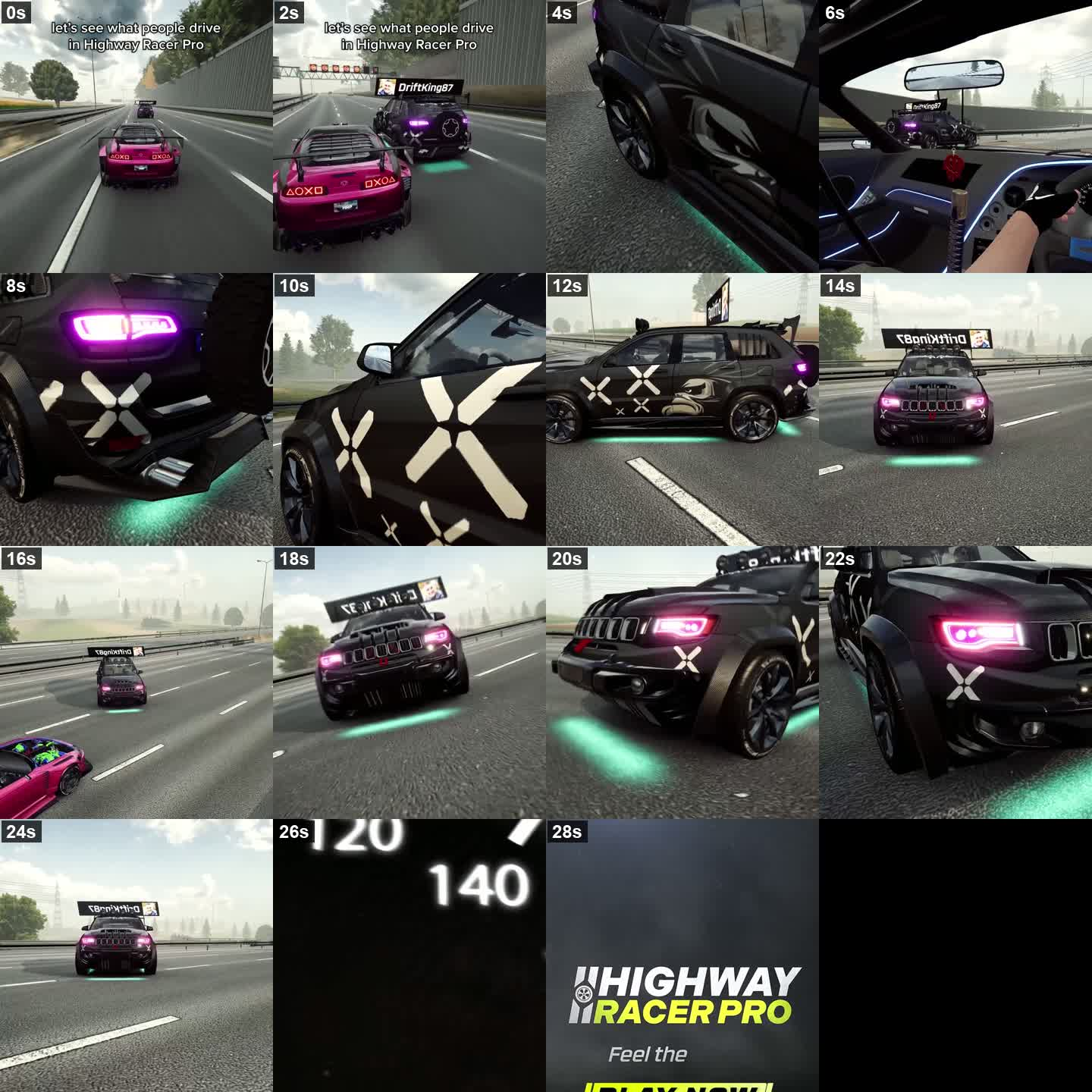
| 00:00–00:03 | Third-person chase view: a pink sports car on a highway behind a black SUV. Text overlay lands over the gameplay. | "let's see what people drive in Highway Racer Pro" | Engine hum, upbeat electronic music starts | Attention / Hook |
| 00:03–00:09 | Cut to a black Jeep Grand Cherokee Trackhawk — front grille, hood scoop, green underglow pooling on the tarmac | none | Music intensifies, tyre screech | Interest / Feature showcase |
| 00:09–00:14 | Rear three-quarter: spoiler, spare wheel on the tailgate, purple tail lights; then a side profile with oversized white "X" decals on the doors | none | Rhythmic music continues | Interest / Detail |
| 00:14–00:20 | Low-angle and wide shots of the Jeep on the move; a roof sign carrying a player handle | none | Music continues | Desire / Social proof |
| 00:20–00:26 | Low angle on the wheels; a glimpse of the pink car's interior and blue ambient dash lighting | none | Music builds to a crescendo | Desire / Immersion |
| 00:26–00:30 | Blurred speedometer needle sweeping up through 100 → 120 → 140, then a flash cut to the logo | HIGHWAY RACER PRO / "Feel the Speed", then a yellow PLAY NOW button | Whoosh, music resolves | Action / Branding |
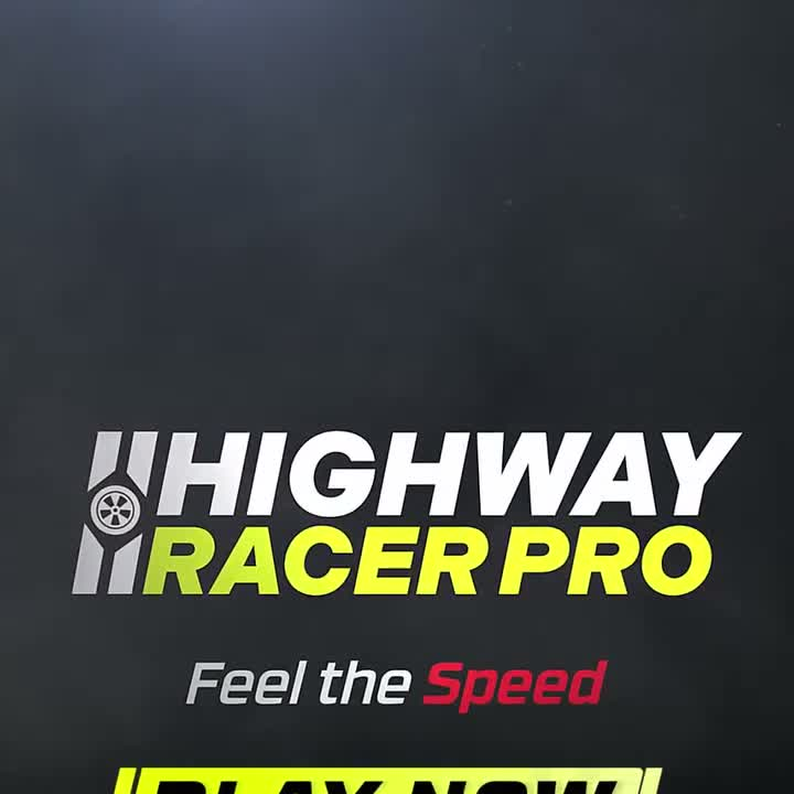
What the structure is doing. The hook is a question — but a question about other people, not about the product. "Let's see what people drive" makes you curious about a community, which is a social hook rather than a product hook. Then 78% of the runtime is pure visual inventory: angle after angle of one heavily modified car, with no narration at all. The social proof is a player's handle on a roof sign — that single prop does more work than any claim could, because it says players build these. And the close asks for almost nothing: 12% of the runtime, a logo and a two-word tagline.
Two things worth stealing. First, if your product is customisation, the ad doesn't have to argue — it has to be specific enough (decals, underglow, wheels, another player's name) that the viewer believes people are already doing this. Specificity is doing the work a claim would otherwise have to do. Second, notice where the CTA sits: the PLAY NOW button only slides in from the bottom edge in roughly the last 1.5 seconds, and in this square cut it's still partly outside the frame when the ad ends. That's worth auditing on your own creatives — if you're re-cutting a vertical end card down to 1:1, the button is the first thing that falls off the bottom. A CTA that never fully arrives is worse than no CTA, because you paid 30 seconds for the ask.
Example 2 — Revolut: 15 seconds, one visual gag, brand on screen from frame one
| Metric | Observation |
|---|---|
| Advertiser | Revolut |
| Category | Fintech (premium card) |
| Length | 14.7s |
| Aspect ratio | 9:16 — vertical, 720×1280 |
| Market | Netherlands (Dutch-language copy) |
| First seen | 5 Oct 2026 |
| Reported running days | 8 |
| Duration ratio | hook 29% / body 50% / close 21% |
| Spoken dialogue | no captions; audio is carried by the track and the performance |
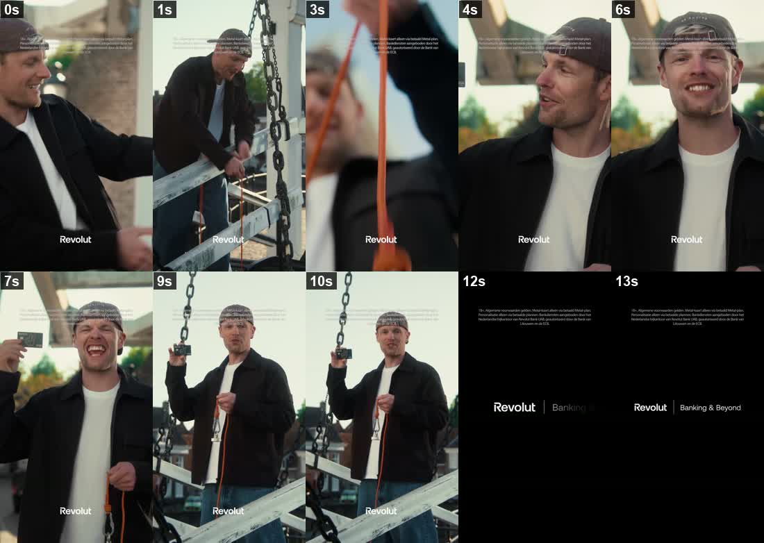
Segment by segment
| Time | What's on screen | Dialogue / text | Sound | Funnel stage |
|---|---|---|---|---|
| 00:00–00:04 | Handheld, motion-blurred open on a bridge: a man in a cap hauls on an orange rope, grinning. Brand wordmark burned in at bottom centre from the first frame. | Dutch legal disclaimer pinned to the top of the frame | Music building tension | Attention / Hook |
| 00:04–00:11 | The rope comes up with a black Revolut Metal card on the end. He lifts it, holds it up, laughs straight at camera. | Same disclaimer overlay | Music shifts upbeat | Interest / Desire |
| 00:11–00:15 | Cut to black. Wordmark and slogan. | "Revolut | Banking & Beyond" + disclaimer | Music resolves out | Action / Brand recall |
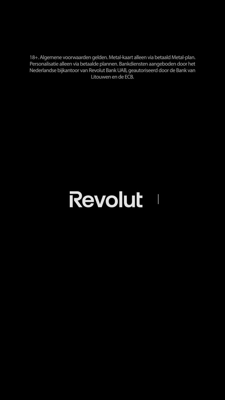
The copy, as it appears on screen (Dutch original → English):
"18+. Algemene voorwaarden gelden. Metal-kaart alleen via betaald Metal-plan. Personalisatie alleen via betaalde plannen. Bankdiensten aangeboden door het Nederlandse bijkantoor van Revolut Bank UAB, geautoriseerd door de Bank van Litouwen en de ECB."
"18+. Terms and conditions apply. Metal card only with a paid Metal plan. Personalisation only with paid plans. Banking services provided by the Dutch branch of Revolut Bank UAB, authorised by the Bank of Lithuania and the ECB."
What the structure is doing. Two decisions stand out, and neither is about the story.
The first is the 29% hook — the largest hook share of the three, spent on a man pulling a rope for four seconds before you know what he's pulling. That's a deliberate bet, and it only pays because the reveal is genuinely unexpected: nobody expects a bank card to come up out of a canal on the end of a rope. Spend 29% of a 14-second ad on a predictable payoff and you have burned a third of your budget.
The second is the packaging of the legal text. There's a Dutch disclaimer pinned over the first 11 seconds of live action, and the problem with legal copy is normally that it has to live somewhere — and the place it usually lands is a static frame at the end, eating the close. Here it sits as a translucent overlay while the story plays underneath, and the close keeps all 21% of its runtime for the wordmark and the slogan. If you're in a regulated category, that's the more interesting thing in this ad than the joke.
Third detail, easy to miss and cheap to copy: the brand wordmark is burned into the bottom of the frame from the very first frame, not just on the end card. On a 15-second ad that has to survive being scrolled past, the brand is present in every thumbnail.
What to watch out for. This ad was 8 days into rotation when we collected it. Nothing above should be read as a verdict on whether it worked — duration and impressions aren't outcomes, and a two-week-old creative has barely started.
Example 3 — Shoop: 29 seconds, and it teaches you how to use the product
| Metric | Observation |
|---|---|
| Advertiser | Shoop — Cashback & Gutscheine |
| Category | Cashback / shopping app |
| Length | 28.7s |
| Aspect ratio | 9:16 — vertical, 720×1280 |
| Market | Germany (German-language copy) |
| First seen | 3 Jun 2026 |
| Reported running days | 130 |
| Duration ratio | hook 21% / body 43% / close 36% |
| Spoken dialogue | full German voiceover, every line captioned on screen |
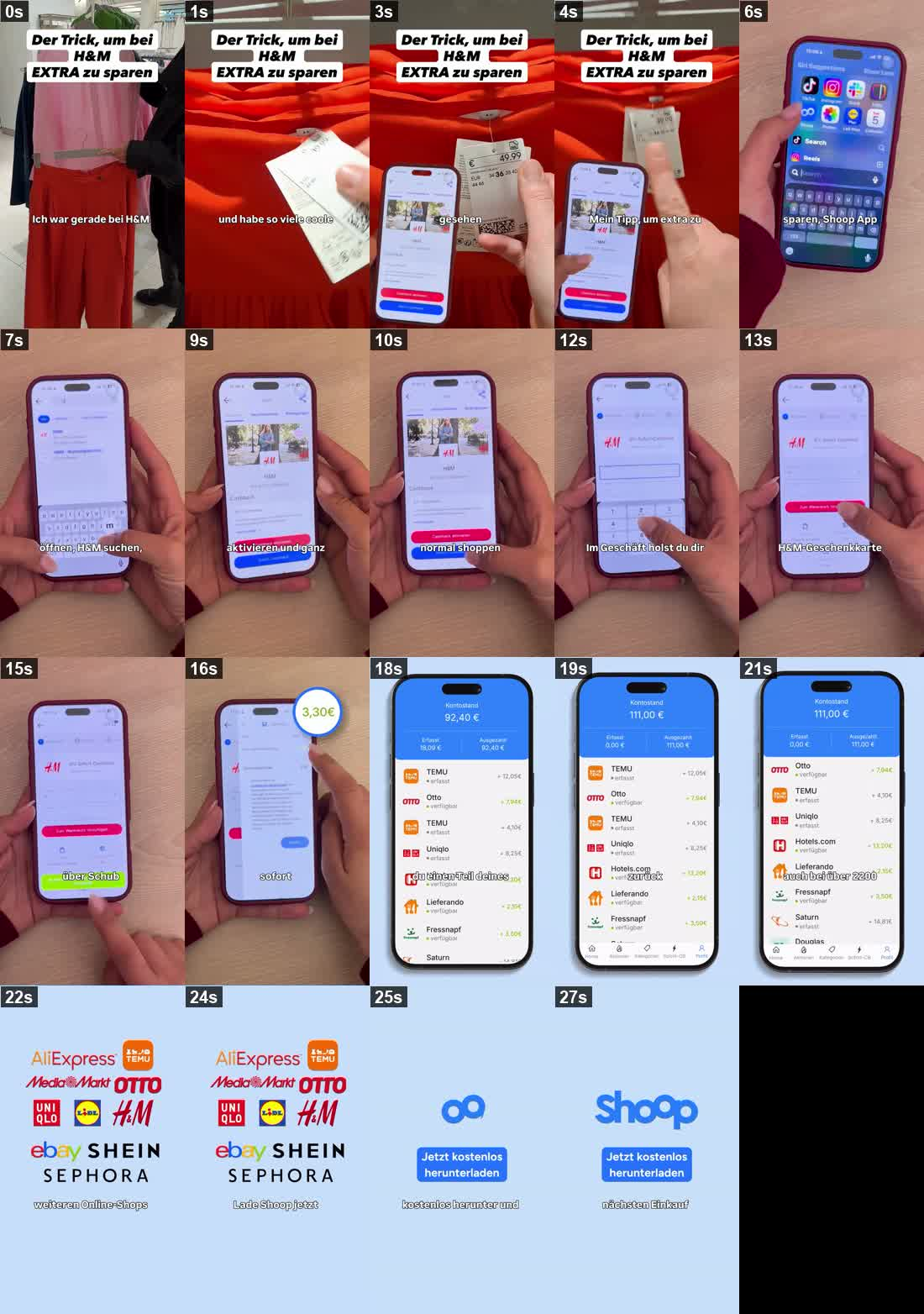
Segment by segment
| Time | What's on screen | Dialogue / text | Sound | Funnel stage |
|---|---|---|---|---|
| 00:00–00:06 | Real, hand-held footage in an H&M store — a shopper holding up garments. A bold claim sits at the top of the frame. | "Der Trick, um bei H&M EXTRA zu sparen" — "The trick to save EXTRA at H&M". Caption: "Ich war gerade bei H&M und habe so viele coole Frühjahr-Sommer-Looks gesehen…" — "I was just at H&M and saw so many cool spring/summer looks…" | Upbeat pop, female voiceover | Attention / Hook |
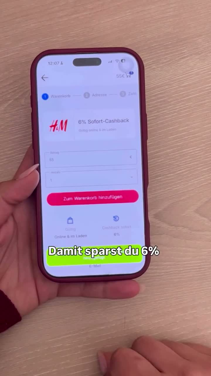
| 00:06–00:18 | Direct screen recording of iOS: search "Shoop", open the app, search H&M, tap Cashback aktivieren, buy a gift card, amount 55, then "6% Sofort-Cashback" and a €3,30 savings bubble | "…Shoop App öffnen, H&M suchen, Cashback aktivieren und ganz normal shoppen." — "open the Shoop app, search H&M, activate cashback and shop as normal." Then: "Im Geschäft holst du dir einfach eine H&M Geschenkkarte. Damit sparst du 6% sofort." — "In store you just get an H&M gift card. That saves you 6% instantly." | Voiceover, UI click sounds | Interest → Desire / Mechanism |
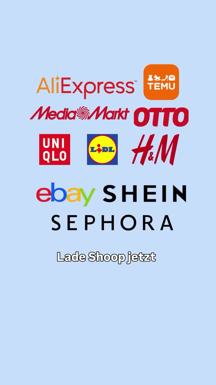
| 00:18–00:28 | Scrolling list of earnings from Temu, Otto, Uniqlo, Hotels.com, Lieferando and others; account balance €111,00. Then a wall of ten partner logos with "Lade Shoop jetzt" | "Nach dem Kauf bekommst du einen Teil deines Geldes zurück. Und das funktioniert auch bei über 2200 weiteren Online-Shops." — "After the purchase you get part of your money back. And it works at over 2,200 other online shops too." | Voiceover, scrolling SFX | Trust / Social proof |
| 00:25–00:29 | Shoop logo with "Jetzt kostenlos herunterladen" | "Lade Shoop jetzt kostenlos herunter und probiere es beim nächsten Einkauf." — "Download Shoop for free now and try it on your next purchase." | Voiceover, music fades | Action / CTA |
What the structure is doing. The hook names a retailer — H&M — rather than saying "shops", so within one second the viewer knows whether this applies to them. That's a targeting decision made in the copy, not in the placement.
The body is a screen recording, and the proof is the interface itself: you watch the taps happen. No rendered mockup, no animation of a phone. Then the close takes 36% of the runtime — the longest of the three — and spends it on two objections rather than on the pitch: a balance screen answering "does this actually pay out", and a logo wall answering "does it work where I shop". Only then does it ask, and it asks twice, in two forms: "Lade Shoop jetzt" over the logo wall, then "Jetzt kostenlos herunterladen" on the closing card.
One production detail that does a lot of quiet work: every spoken line is captioned on screen for the whole 29 seconds. Most vertical feeds autoplay muted. This ad is fully legible with the sound off, and the voiceover becomes reinforcement rather than a requirement.
What to take from it. When your category is already understood, the ad's job isn't to explain it — it's to remove the "yes, but how" objection. That takes runtime, and it takes showing real UI. If your close is a logo and a tagline, that can be exactly right; but compare it against giving a third of your ad to the two questions a buyer is actually holding.
What the three have in common
| Metric | Highway Racer Pro | Revolut | Shoop |
|---|---|---|---|
| Category | Mobile game | Fintech | Cashback app |
| Length | 30.1s | 14.7s | 28.7s |
| Aspect ratio | 1:1 | 9:16 | 9:16 |
| Market language | English | Dutch | German |
| Hook share | 10% | 29% | 21% |
| Body share | 78% | 50% | 43% |
| Close share | 12% | 21% | 36% |
| Hook type | Question about other players | Suspenseful action | Named retailer + benefit |
| Spoken dialogue | None | None captioned | Full captioned voiceover |
| Close asks for | Logo + tagline + PLAY NOW | Logo + slogan | Logo + logo wall + download, twice |
| Reported running days | 72 | 8 | 130 |
Four things stand out.
All three load the decisive move into the first few seconds, and none of them opens with the product. A question about other players. A rope being pulled. A claim plus a named retailer. In every case the product shows up after the viewer has a reason to care — and in none of the three does the ad start by explaining what the product is.
None of them explains its category. The game assumes you know what a racing game is. The fintech shows a card instead of describing a bank. The cashback app names a retailer instead of explaining cashback. Explaining the category is the most expensive thing an ad can do, and all three skip it — which is only safe because these are all categories the viewer already lives in. If yours isn't, this is the one pattern here you shouldn't copy.
The close scales with how much convincing is left over. The racing game, with the least to prove, gives its close 12% and spends it on a logo. The fintech, which has to land a joke, gives it 21%. The cashback app, which has to prove that money actually arrives and that it works where you shop, gives its close 36% — and asks twice. That gradient isn't a stylistic difference. It's three different answers to the question "how much does the viewer still not believe?" If your close is a logo and a prayer, that might be exactly right — or it might be where the sale is being lost.
Length is a consequence, not a starting point. These three land at 15, 29 and 30 seconds, and the shortest one is the one with the least explaining to do. Start from what has to be proven and let the runtime fall out of it.
Again: three ads is three ads. Use the ratios as a lens, not as targets.
What you can and can't learn from someone else's ad
You can see: what's on screen and for how long, the dialogue and on-screen text, the sound design, the aspect ratio and the cut, which market the copy is written for, when the ad was first and last seen, how many days it's been in rotation, and how many creatives that advertiser is running at once.
You can't see: the spend behind it, the ROAS, the CPA, the targeting, or the conversion rate. Exact campaign outcomes and targeting are generally private advertiser data; public research signals should not be treated as a substitute.
So be careful with the obvious inference. A long-running ad shows repeated observation — it does not mean the ad is profitable. Plenty of creatives keep serving because nobody remembered to switch them off. Duration is a reason to look closer, not a verdict. Same in the other direction: Revolut's ad here was 8 days old, and a young creative tells you nothing yet.
And a practical note on what you may actually use. Breaking an ad down is research, not a licence. Copy the structure — the ratio, where the proof sits, what the close does. Don't re-cut somebody's footage into your own ad, and if you re-host a competitor clip for an internal teardown, keep it short, attribute it, and don't leave it up in public.
How to pick the ads worth breaking down
Breaking an ad down is only useful if you're breaking down the right ads. What you want is creative that is still in rotation, in your category, from advertisers running enough volume that the ad survived long enough to matter — not the one ad that happened to go viral last month.
That's a search problem before it's an analysis problem. Filter by category and platform, group results by advertiser, sort by how long each creative has been live, then start from the top. The three ads above came out of exactly that pass: BigSpy's trending list, top of the rankings, different categories, all still live. How to find similar ads walks through the workflow, and BigSpy lets you browse by platform, format, category and advertiser — you can see first-seen and last-seen dates on each creative, which is what turns "this ad looks good" into "this ad has been running for 130 days".
If you'd rather come at this from the production side — what high-performing creatives tend to have in common before they ever run — our piece on AI-powered ad creatives covers that.
Video Ad Examples FAQ
The opening — usually the first three to six seconds — before the viewer decides to keep watching. Across these three it was a question ("let's see what people drive in Highway Racer Pro"), a suspenseful action (a man hauling a rope up off a bridge), and a claim plus a named retailer (saving extra at H&M).